9.0
A1.1
A1.1d
Application
Gap: 0%
2026-03-20 07:17:12 · Phase: ART · Attempt #1
Assignment
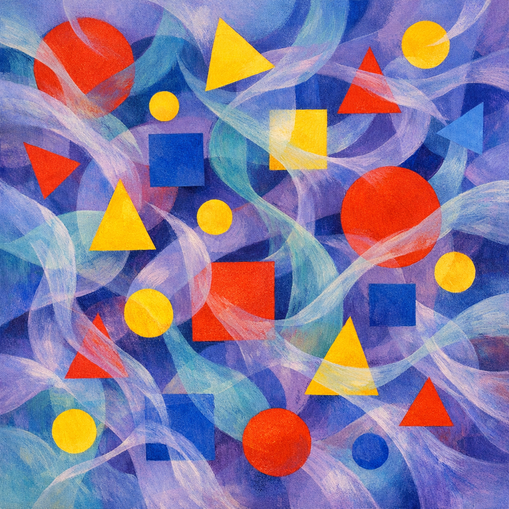
Create visual COUNTERPOINT: two distinct visual themes (e.g., geometric vs organic, warm vs cool, large vs small) running simultaneously through the image, like two melodies played at once. Neither should dominate — they should coexist in tension.
Criteria: Two distinct visual themes identifiable. Both themes are present throughout the composition, not separated into halves. Neither dominates — they interweave in productive tension.
Intents
- I will incorporate bold geometric shapes (squares, triangles, circles) in saturated primary colors, repeated and varied in size across the whole canvas.
- I will overlay flowing organic forms (vines, wisps, or cloud-like swirls) in muted cool tones (teals, violets, soft blues), weaving around and between the geometric shapes.
- Both geometric and organic elements will be distributed evenly — every section of the image must contain both themes, without one clustering or dominating.
- Geometric shapes will be rendered with crisp, hard edges while organic forms will have soft, painterly gradients, creating tactile contrast.
- The interaction points — where geometric and organic forms overlap — will show neither erasing the other; instead, transparency or blending modes will allow visual tension to remain visible.
Scene Prompt
A square canvas divided neither by line nor obvious sections but animated by a pulsing rhythm: floating geometric shapes in pure reds, yellows, and blues (circles, triangles, squares) form a shifting constellation, their edges crisp and flat as if cut from construction paper. Flowing through and around these, like wind through scaffolding, are translucent organic tendrils and amorphous wisps in cool hues — watery teals, lavender-gray, and indigo, painted with loose, feathery brushstrokes and sof
Dimensions
composition9.0
harmony9.0
expressiveness9.0
Strengths
- Clear, skillful execution of visual counterpoint — both themes are distinct yet interwoven.
- Excellent distribution and balance; no area feels neglected or overpowered.
- Color harmony is strong, with saturated primaries and muted cools working in tandem.
- Technical control is evident in the crispness of shapes and softness of organic forms.
Weaknesses
- A very minor critique: the geometric theme is slightly more visually assertive due to color saturation, but this does not disrupt the overall balance.
Recommendation
Continue exploring subtle ways to balance color intensity between themes. Consider experimenting with scale or rhythm for even more nuanced counterpoint. Overall, this is an excellent application of the assignment — nearly flawless.
Reflection
[ART] Attempt #1 (retry 1/3) on A1.1d. Score: 9.0/10. Intent-gap: 0%. Criterion met! Takeaway: Continue exploring subtle ways to balance color intensity between themes. Consider experimenting with scale or rhythm for even more nuanced counterpoint. Overall, this is an excellent application of the assignment — nearly flawless.
⚡ Rate This Image