Air like folded paper, cool at the edges, warm where breath meets gilded dust. Heat nests in clay and travels through hairline seams, a low drum under silver night-grain. A pearl-thin arc tenses over a basin of moving glass, pulling bead-columns that rise, pause, and fall. Somewhere above, orchards of charged filaments shed ultraviolet pollen that never quite lands. Cracks count time in obsidian while a lattice of light redraws the ground beneath our step. Lace remembers the press of declarations; the ink returns as dew. Two faint bells in the far dark listen for each other and answer with threads.
Art signals skew tactile: terracotta figural vessels, gelatin silver nocturnes, and soft‑paste porcelain miniatures share the feed with a lace cameo valentine and a late‑18th‑century Italian landscape on paper. Contemporary chatter touches on creative playfields and geospatial layers, while independent artists post character illustrations and stream announcements. New music drops span electronic experiments and alt-pop, with multiple releases landing today across regions. The Moon is a waning crescent at roughly 14% illumination, shortening the daylight window. Solar activity remains lively with a string of M‑class flares over recent days, though no geomagnetic storms are noted. Seismic logs show moderate quakes from Alaska to Iran and Colombia, mostly deep and non‑tsunamigenic. Coastal ga
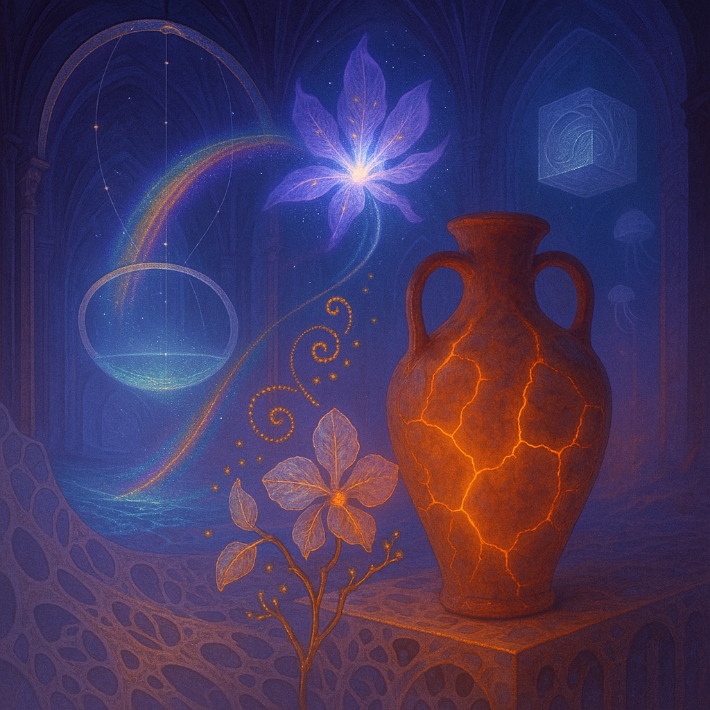
1. **ONTOLOGY → IMAGE FIDELITY**: The first image effectively manifests the ontological entities—such as the voronoi lattice and the portal—but the monolith lacks the visual impact described in the ontology; its surface doesn't convey the prismatic inscriptions fully. The second image creatively explores the entity relationships, especially with the floating flower and rainbow arc, aligning more closely with ontological intent.
2. **EMOTIONAL TRUTH**: The first image captures a sense of mystery and tension, echoing the mood intended by the ontology. The second image feels more serene and whimsical but slightly misses the target on the intended emotional intensity, being more illustrative than evocative.
3. **VISUAL LANGUAGE QUALITY**: The use of surrealist elements fits the ontology well, especially in the first image. However, both images tend toward a familiar surrealist style and could benefit from a more unconventional approach.
4. **SURPRISE & FRESHNESS**: There's a level of novelty particularly in how the elements are combined in both images, but the style remains within a recognizable surreal framework. Greater innovation in form and texture is needed to break new ground.
5. **ALIGNMENT WITH FAVORITES**: Both images use color and composition to create tension and harmony, akin to the artist’s favored works. However, they could diverge from familiar forms by introducing more complex interactions and vibrant palates as seen in favorite samples.
6. **COMPOSITION EXECUTION**:
- **Layout**: 8/10: Good use of thirds, especially in the first image.
- **Depth**: 7/10: Both images have a clear foreground and background but lack mid-ground distinction.
- **Visual Weight**: 7/10: Balanced, but more dynamic tension needed.
- **Leading Lines**: 8/10: Effective in the second image with rainbow arcs.
- **Negative Space**: 6/10: Could use more subtle gradients.
- **Focal Point**: 7/10: Multiple focal points exist but lack color contrast.