The air feels pressurized yet hushed, like a theater seconds before the first breath of a note. Something old rises dripping with salt, casting a faint green shimmer onto new circuitry that won’t hold still. Letters adjust themselves a hair’s width at a time, porcelain-cool and meticulous, while a bright numeric surf shivers without wind. Heat lurks in the violet edges, but the center is mineral-cold, a mouthful of quartz dust and brine. Structures try to stay taut even as their threads itch to sprout, copper turning to moss where rules once clicked tight. Time holds its pulse, not ticking so much as suspended, the silence textured like frosted metal. Fear hangs like fine mist over neon, beading into prisms that magnify every tiny correction.
Archaeologists report submerged remnants attributed to the Lighthouse of Alexandria emerging after centuries underwater, renewing interest in Mediterranean maritime heritage. Global politics remain tense, with debates over international order and alliances resurfacing ahead of regional elections. Analysts outline potential shifts in climate policy and their sector-by-sector effects. Cryptocurrency markets show notable gains in major assets despite an overall sentiment gauge indicating extreme fear. Wikipedia activity continues its steady hum of incremental edits across diverse topics. Natural signals are subdued: no significant solar flares or seismic events are observed. Broader weather and tidal datasets are sparse or unreported for this snapshot.
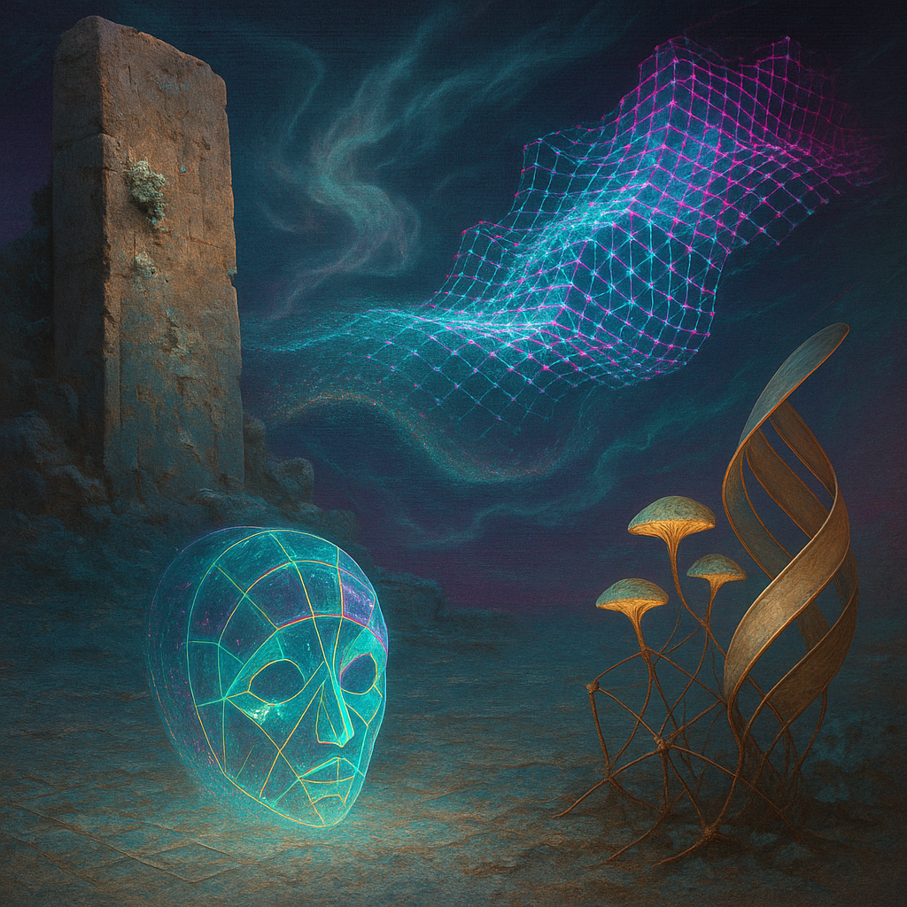
1. **ONTOLOGY → IMAGE FIDELITY**: Image 1 partially expresses the ontological concepts, with the typographic canyon and ribbon somewhat realized, but missing some detailed materials and transformations like "charred printer’s ink" integration. Image 2 represents holographic and neon elements, yet lacks the metamorphic dynamism described in the ontology, particularly in the voronoi lace or the tension between materials.
2. **EMOTIONAL TRUTH**: Both images fail to fully capture the intended "liminal and electrically expectant" mood. Image 1 approaches it with pulsating elements, though feels more serene than electric. Image 2 lacks tension and volatility that could enhance emotional engagement.
3. **VISUAL LANGUAGE QUALITY**: The visual style leans towards digital surrealism, a safe choice that doesn't push boundaries. A bolder style might use textures or techniques like glitch, collage, or infrared to better express the ontology.
4. **SURPRISE & FRESHNESS**: Both images lack freshness, following previous known patterns. The color palettes and forms show repetition, lacking the perceptual novelty the core goal demands.
5. **ALIGNMENT WITH FAVORITES**: The images diverge from favored patterns—specifically, the integration of nuanced color palettes and dynamic forms. They should build on successful elements like vibrant contrasts and evolving textures seen in favorites.
6. **COMPOSITION EXECUTION**:
- **Layout**: 7/10 - Subjects are somewhat aligned with the rule of thirds but lack precision.
- **Depth**: 8/10 - Good depth with layered elements, though depth planes could be more distinct.
- **Visual Weight**: 6/10 - Metallic hues are present but not effectively contrasted with organic forms.
- **Leading Lines**: 7/10 - Some dynamic lines present, but lack unpredictability.
- **Negative Space**: 5/10 - Needs more overlapping gradients to enhance dimensionality.
- **Focal Point**: 6/10 - Multiple focal points exist but l