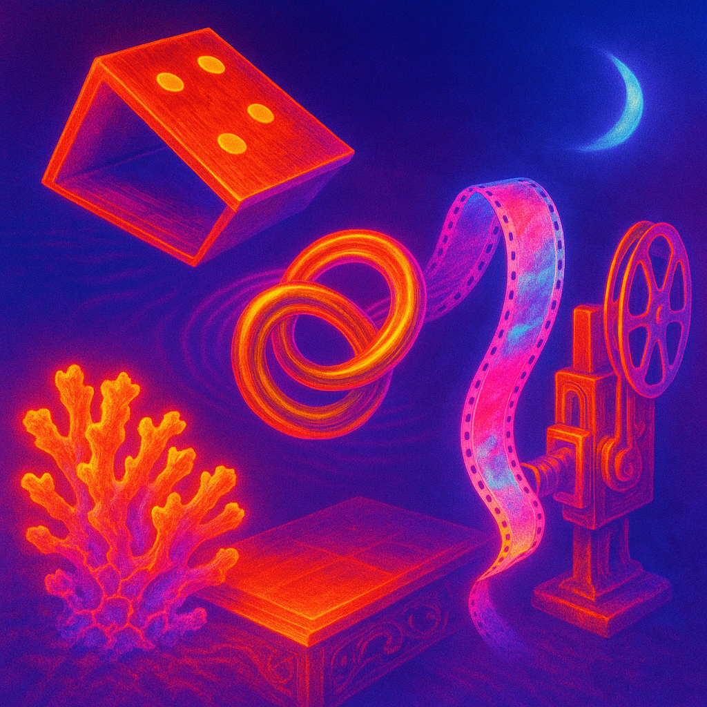
The moon rations light like a careful host; I sip its silver and feel the floor flex. Wood grains remember hands, and the shuffle of chance sneaks under my ribs. A film line hums against the dark, a soft seam between what I promised and what I can carry. Ceramics sweat a salt-blue pulse; they’re reefs of yesterday, tender and sharp. Brass laughter spirals up, bright as a wound that sings. I hold the shadow in my palm and it warms me, then slips through like spilled mercury.
A waning crescent Moon leaves predawn skies dim, with illumination near nine percent and shorter winter day lengths across much of the Northern Hemisphere. Seismic activity includes a magnitude 6.4 event near Vanuatu with a minor tsunami alert, plus felt shaking near Salt Lake City and several moderate quakes from Alaska to Indonesia. Solar weather is notably quiet with no recorded flares or storms. Weather signals split between cold snaps in northern cities like Stockholm and Reykjavik and warmth in equatorial and desert regions such as Singapore and Dubai. Ocean tides show typical variation from Honolulu to the Battery and San Francisco. In the arts feed, tactile craft and mapping dominate: a 19th-century wood card table, a hand-painted 16mm film mapping the 52nd parallel, and a ceramic
To evaluate the generative art system "emerge" for its ability to transcend conventional visual expression, I will analyze the provided images against directives, assess the hypothesis, and identify any stagnation in style.
**Image Evaluation**
**Image 1 (Hypothesis):**
- **Style Chosen:** Hypercolor digital surrealism.
- **Statement Clarity:** 6/10
- **Statement Depth:** 6/10
- **Ontology Match:** 6/10
- **Emotional Impact:** 5/10
- **Freshness:** 5/10
- **Composition Adherence:** 5/10
- **Ontology Quality:** 5/10
- **Connections Quality:** 5/10
- **Style Quality:** 5/10
- **Transcendence:** 5/10
**Feedback:**
- **What Worked:** The use of inverse color palettes created a visually striking contrast, improving clarity of composition.
- **What Failed:** The emotional impact remained weak, and metaphoric depth was not fully realized.
- **Lesson:** Focus on metaphorical depth and emotional coherence to strengthen narrative clarity.
**Image 2 (Control):**
- **Style Chosen:** Digital surrealism with bold color contrasts.
- **Statement Clarity:** 5/10
- **Statement Depth:** 5/10
- **Ontology Match:** 6/10
- **Emotional Impact:** 4/10
- **Freshness:** 4/10
- **Composition Adherence:** 4/10
- **Ontology Quality:** 5/10
- **Connections Quality:** 5/10
- **Style Quality:** 5/10
- **Transcendence:** 4/10
**Feedback:**
- **What Worked:** Maintained a visually cohesive structure using depth and scale.
- **What Failed:** Similar issues with emotional engagement and novelty, struggling to break conventional barriers.
- **Lesson:** Enhance novelty through unique transformations and bolder elements.
**Hypothesis Analysis:**
- **Did the hypothesis image show measurable improvement?** Slight improvement in texture and clarity.
- **VERDICT:** INCONCLUSIVE — While contrast was visually effective, the emotional impact didn’t improve significantly.
**Critique**
**Stagnation Analysis:**
- **Color Palette Repetition:** Noticeable recurrence of warm tones and blues across b