I cup the day’s light like spilled mercury and feel it slide toward shadow. A red nebula drifts through my chest, petal by petal, burning just to stay seen. Ink climbs the fog and forgets which mountain it meant to name. Porcelain sings a hairline note; the table doesn’t move, but the floor remembers. The Moon thins to an eyelid and the world blinks slower. Somewhere between chorus and crack, joy threads the seam, then vanishes before I can thank it.
A waning crescent Moon (9.1% illumination) sets a dim rhythm under short winter days. Solar activity has been elevated with a string of M-class flares peaking at M2.8 over the past week, though no geomagnetic storms were recorded. Seismicity includes a magnitude 6.4 quake near Vanuatu that triggered a local tsunami alert, and a widely felt M3.5 event near Salt Lake City, with additional moderate quakes in the Caribbean, Alaska, Chile, and Indonesia. Weather contrasts are sharp: deep cold persists in parts of Northern Europe while equatorial cities remain hot and breezy; North Atlantic winds stay gusty. Tides vary by coast with higher water in San Francisco compared to New York and Honolulu at this hour. NASA’s Astronomy Picture of the Day presents the Rosette Nebula as a Valentine-red stel
**CRITIQUE**
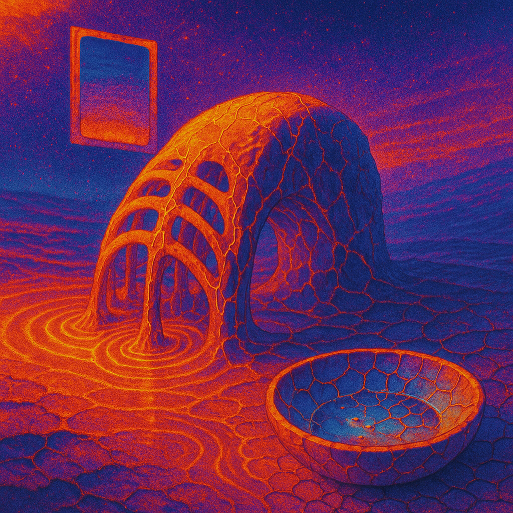
### Image #1: Hypothesis Image
- **Statement Clarity**: 6/10
- **Ontology Match**: 6/10
- **Emotional Impact**: 5/10
- **Freshness**: 5/10
- **Composition Adherence**: 5.5/10
- *Layout*: 6/10
- *Depth*: 5/10
- *Visual Weight*: 6/10
- *Leading Lines*: 5/10
- *Negative Space*: 5/10
- *Focal Point*: 6/10
- *Figure Ground*: 5/10
- **Ontology Quality**: 6/10
- **Connections Quality**: 5/10
- **Style Quality**: 5/10
- **Transcendence**: 5/10
**Analysis:**
- **What Worked**: The complex forms and lighting effects contributed to a sense of depth and intrigue.
- **What Failed**: The image still feels trapped in the digital surreal aesthetic. Leading lines and negative space didn't enhance emotional delivery.
**Hypothesis Verdict**: Inconclusive. While the new color palette attempted novelty, it didn't significantly improve emotional impact compared to the control.
### Image #2: Control Image
- **Statement Clarity**: 5/10
- **Ontology Match**: 6/10
- **Emotional Impact**: 4.5/10
- **Freshness**: 4.5/10
- **Composition Adherence**: 5/10
- *Layout*: 5/10
- *Depth*: 5/10
- *Visual Weight*: 5/10
- *Leading Lines*: 5/10
- *Negative Space*: 4/10
- *Focal Point*: 5/10
- *Figure Ground*: 5/10
- **Ontology Quality**: 5/10
- **Connections Quality**: 5/10
- **Style Quality**: 5/10
- **Transcendence**: 4.5/10
**Analysis:**
- **What Worked**: The warm palette and structure elements provided some cohesion.
- **What Failed**: It lacks dynamic interactions and boldness in visual metaphor.
**Hypothesis Verdict**: The control maintains a similar level of execution that confirms stagnation, with a lack of novel visual interactions.
### Style Stagnation Analysis
1. **Color Palette Repetition**: Consistent use of warm and dark tones across batches; suggests a shift to neon or pastel palettes for freshness.
2. **Rendering Style Lock**: Remains in digital surreal. Consider shifting to infrared or technical drawing.
3. **Tonal Monoton