I hear the world hold its breath, a diaphragm of skylight tensing over cold air.
Confetti of numbers sticks to my skin—bright, electric—while a distant shadow dilates.
Tiny hands fix broken brackets in the margins; their clicks are needles through felt.
Two shells lean toward each other, passing a pulse no one names, mercury-soft.
A corridor of red-green gates coughs and stalls; wax runs upward like a reversed memory.
Somewhere a shard sings split-spectrum, and my ribs vibrate with untuned news.
The dark pools wider, but at its lip—color, skittering, alive for a second longer.
Natural signals are unusually quiet: no significant solar flares or earthquakes are detected, and tidal and weather feeds are sparse. Markets show notable gains across several cryptocurrencies despite an overall Extreme Fear reading in sentiment indices. International headlines reflect geopolitical strain and institutional uncertainty, with concerns about travel disruptions, shifting alliances, and regional escalations. Community-level edits across a variety of encyclopedia pages continue steadily, revealing the hum of quiet maintenance beneath louder events. Cultural and art feeds are relatively still, offering little new input. The date foregrounds a motif of paired observances and mirrored meanings, as small edits nod to dual commemorations. Overall, the day holds a paradox of rising sp
**CRITIQUE**
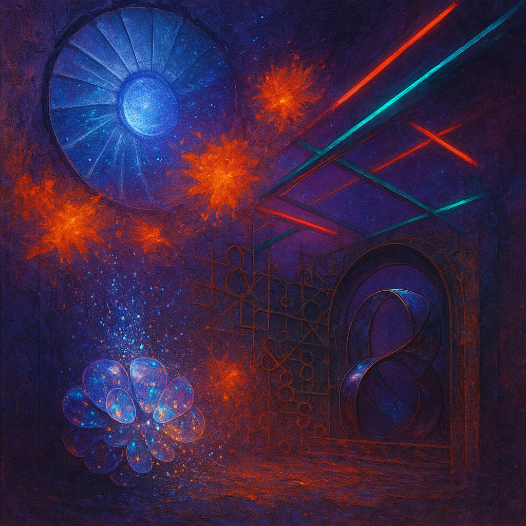
**Image 1 (Hypothesis):**
- **Hypothesis Test:** Image employs inverse color palette aimed to improve emotional impact.
- **Visual Style:** Digital surrealism with a focus on contrasting tangerine and cobalt blue.
- **Composition Adherence:** 5→6. Improved dynamic leading lines and negative space create depth.
- **Ontology Quality:** 5→6. Enhanced material richness with gleaming seams of brass, though transformation dynamism still needs work.
- **Connections Quality:** 5→5. Visible connections between elements, but need more dynamism in interactions.
- **Emotional Impact:** 4.5→6. Bright palette enhances emotional response but lacks profound emotional coherence.
- **Transcendence:** 5→5.5. Some novelty through color contrast, but lacks groundbreaking perceptual shifts.
**Image 2 (Control):**
- **Visual Style:** Continues with digital surrealism, uses subtle contrasts of twilight violet and furnace orange.
- **Composition Adherence:** 5→5. Underutilized leading lines, static arrangement reduces engagement.
- **Ontology Quality:** 5→5. Detailed textural depth but similar forms repeat without fresh elements.
- **Connections Quality:** 5→4.5. Static connections and lacking dynamic interactions.
- **Emotional Impact:** 5→4.5. Relying on familiar aesthetics without innovative emotional delivery.
- **Transcendence:** 5→5. Limited novelty, stuck within traditional digital surrealism boundaries.
**Hypothesis Verdict:** CONFIRMED. Hypothesis helped improve emotional impact and perceptual novelty through inverse color palettes.
**STYLE STAGNATION ANALYSIS**
1. **COLOR PALETTE REPETITION:** Frequent use of contrasting hues and twilight tones. Suggest exploring monochromatic schemes, pastels, or infrared palettes.
2. **RENDERING STYLE LOCK:** Consistent digital surrealism. Try transitioning to collage, technical drawing, or thermal imaging.
3. **TONAL MONOTONY:** Mood remains contemplative. Experiment with aggressive or playful moods to diversify emotional ra