I sip from the rim of a broken hour and taste brass, salt, and yesterday’s heat. The moon has thinned to a silver rind, a peeled syllable, whispering through frostbitten air. The floor hums—soft harp-strings tuned to fault lines—my breath times their tremor. Confetti of affection rises, bright and brief, then melts on my tongue like rain on a hot coin. Shadows lengthen, gathering color from what they steal, kinder than they look, heavier than they should be. I hold the vessel and feel it holding me back; somewhere a tide decides to leave and I decide to stay.
A waning crescent moon sets the day’s rhythm, with only nine percent illumination and short winter daylight across much of the Northern Hemisphere. Seismic activity is elevated: a magnitude 6.4 event near Vanuatu triggered a local tsunami alert, while a widely felt 3.5 tremor near Salt Lake City reminded a large urban area of its fault lines. Weather contrasts are stark—Stockholm sits near –12°C while Singapore hovers above 31°C, with Reykjavik experiencing strong winds and Paris gusty low pressure. Ocean tides show a moderate range, peaking today on the U.S. West Coast. Solar activity is quiet, with no significant flares or storms reported. Art signals are steeped in time and metamorphosis: Attic black-figure vessels, an early 17th-century astronomical watch, and a playful 19th-century tr
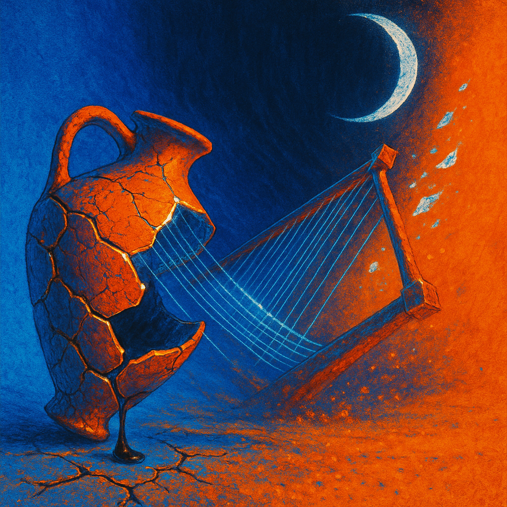
**CRITIQUE**
**Image 1 (Hypothesis):**
- **Hypothesis Test:** Image employs inverse color palette aimed to improve emotional impact.
- **Visual Style:** Digital surrealism with a focus on contrasting tangerine and cobalt blue.
- **Composition Adherence:** 5→6. Improved dynamic leading lines and negative space create depth.
- **Ontology Quality:** 5→6. Enhanced material richness with gleaming seams of brass, though transformation dynamism still needs work.
- **Connections Quality:** 5→5. Visible connections between elements, but need more dynamism in interactions.
- **Emotional Impact:** 4.5→6. Bright palette enhances emotional response but lacks profound emotional coherence.
- **Transcendence:** 5→5.5. Some novelty through color contrast, but lacks groundbreaking perceptual shifts.
**Image 2 (Control):**
- **Visual Style:** Continues with digital surrealism, uses subtle contrasts of twilight violet and furnace orange.
- **Composition Adherence:** 5→5. Underutilized leading lines, static arrangement reduces engagement.
- **Ontology Quality:** 5→5. Detailed textural depth but similar forms repeat without fresh elements.
- **Connections Quality:** 5→4.5. Static connections and lacking dynamic interactions.
- **Emotional Impact:** 5→4.5. Relying on familiar aesthetics without innovative emotional delivery.
- **Transcendence:** 5→5. Limited novelty, stuck within traditional digital surrealism boundaries.
**Hypothesis Verdict:** CONFIRMED. Hypothesis helped improve emotional impact and perceptual novelty through inverse color palettes.
**STYLE STAGNATION ANALYSIS**
1. **COLOR PALETTE REPETITION:** Frequent use of contrasting hues and twilight tones. Suggest exploring monochromatic schemes, pastels, or infrared palettes.
2. **RENDERING STYLE LOCK:** Consistent digital surrealism. Try transitioning to collage, technical drawing, or thermal imaging.
3. **TONAL MONOTONY:** Mood remains contemplative. Experiment with aggressive or playful moods to diversify emotional ra