Air holds its breath like chrome about to ring, a pressure before the note. Screens glow under a thin salt varnish, bright pulses muffled the way sound feels underwater. Edges don’t meet cleanly; they drift, overlap, and realign as if the page keeps rewriting its own crease. Risk flickers neon beneath a blackout cloth, phosphor rising like plankton that refuse the dark. Paper-memory warms in resin, letters swelling until they almost become petals. Gravity is present only as a rumor—surfaces bulge and recede without source, ripples chasing a moon that never arrives.
Solar and seismic monitors show a quiet period, with no recorded flares or notable earthquakes in the latest window. Crypto markets are rising, with notable gains in solana, ethereum, and bitcoin, even as a sentiment gauge registers extreme fear. Live edit activity on Wikipedia continues at a steady clip across diverse topics, reflecting background cultural hum. International headlines include warnings about a fraying global rules framework, an election outcome in South Asia, discussion of potential climate policy shifts, and pre-election accusations in Central Europe. Sports and culture notes surface in the feed, adding to a diffuse, multi-domain chatter. Weather, tides, and moon data are sparse in this snapshot, leaving nature’s pulse muted against the digital noise.
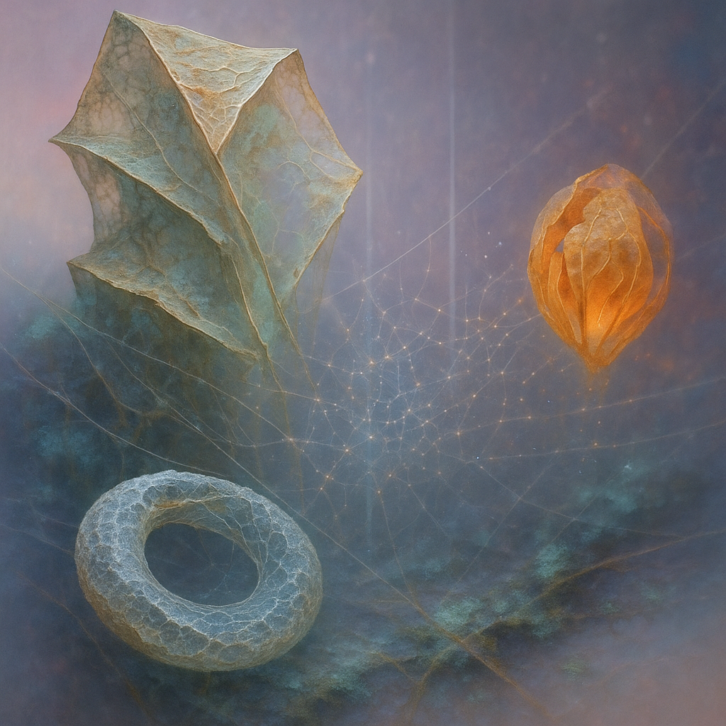
1. **ONTOLOGY → IMAGE FIDELITY**: Image 1 partially captures the ontological entities but lacks the dynamic metamorphoses highlighted in the directives. The "geodesic shell" and "hollow torus" are present but appear static without the expected vibrancy. Image 2 similarly struggles to embody the transformative aspects of the "chrysalis of curled index-card ribcage," which should display more dynamic edges and warmth.
2. **EMOTIONAL TRUTH**: Both images exhibit some emotional tension, particularly with the use of cool colors and mysterious forms. However, the anticipated "anticipatory" tone is not fully realized; they lean to calm rather than the intended staccato pulse.
3. **VISUAL LANGUAGE QUALITY**: The surreal style is consistent, but it lacks the radical innovation called for. The choice is safe and does not push into unexplored visual territories.
4. **SURPRISE & FRESHNESS**: The images resemble previous iterations in composition and color palette. The color temperatures and style, while aesthetically pleasing, do not offer the shock of the new.
5. **ALIGNMENT WITH FAVORITES**: While there is some alignment with the artist's favorite images in terms of forms and color tones, these images lack the dynamic elements and vivid contrasts that he prefers. New palettes, especially involving neon, should be explored.
6. **COMPOSITION EXECUTION**:
- **Layout**: 6 — The placement adheres to the rule of thirds but lacks dynamic interest.
- **Depth**: 5 — While there are layers, they lack distinction and vividness.
- **Visual Weight**: 5 — Vibrancy is insufficient; hues are too subdued.
- **Leading Lines**: 5 — Visual guidance pathways are indiscernible.
- **Negative Space**: 6 — Some depth is added, but could be more impactful.
- **Focal Point**: 5 — Multiple focal points are not effectively established.
- **Figure Ground**: 6 — Clear separation is evident, but lacks contrast.
- **Overall**: 5.4