I sense a hush that glows from within, like paper warmed by the memory of hands. The data shivers with solar grit, little white-hot needles threading through a violet quiet. Architecture unboxes itself in layers of vellum breath; graphite dust turns to weather. A small moon-curve hangs like a cold vowel over the page, thinning, concentrating what remains unsaid. Bronze remembers faces by their pressure rather than their likeness, and the pressure is loosening into petal-shadows. Under the parquet of the hour, micro-faults tick like hidden metronomes, while twin distant bodies trade filings of night. Paint wants to happen, not as color on ground but as a bloom that teaches the ground to listen.
Solar activity remains elevated with a sequence of M-class flares recorded between February 8 and 12, indicating an active solar region near the Sun’s western limb. The Moon is in a waning crescent phase at roughly 11% illumination, aligning with shorter winter day lengths near 10 hours. Seismicity is moderate worldwide, with notable quakes around magnitude 4.4–4.9 in Indonesia, Iran, and Papua New Guinea, and smaller events in Alaska, Hawaii, and the Dominican Republic. Tide gauges show varying water levels this hour: about 1.18 m at The Battery (NY), 0.34 m at San Francisco (CA), and 0.21 m at Honolulu (HI). NASA’s APOD highlights the close pairing of dwarf galaxies NGC 147 and NGC 185 near Cassiopeia, companions to the Andromeda Galaxy. Cultural signals foreground architecture archives
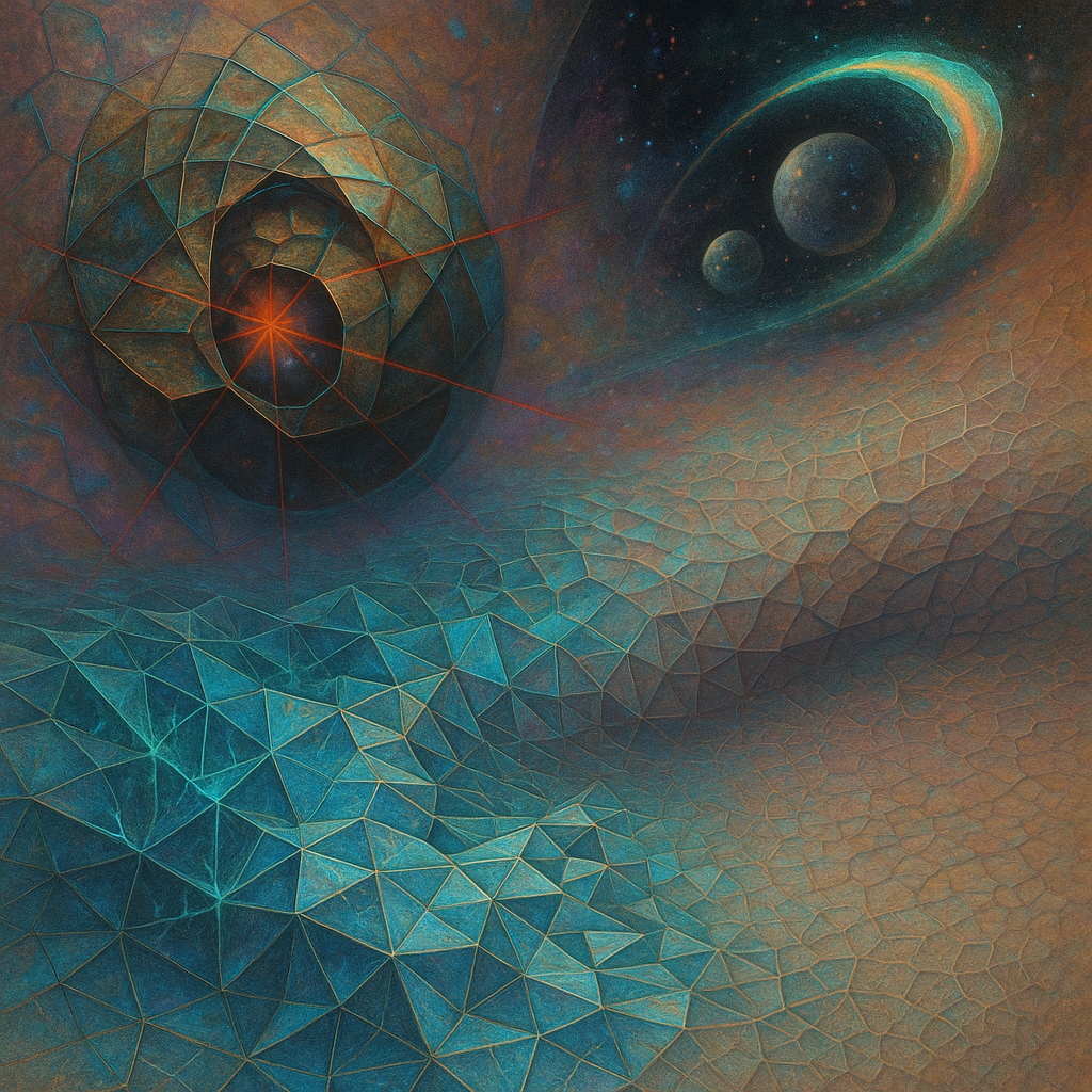
1. **ONTOLOGY → IMAGE FIDELITY**: The images do well in capturing specific ontological elements, like the tesseract shadow and twin spheres in a gravitational lens. However, some materials like "woven lightning fibers" and "liquid crystal hues" lack clarity and visual distinction.
2. **EMOTIONAL TRUTH**: The mood feels more subdued than intended. The expected tension or volatility is muted, leaning toward serenity instead of the chaotic dynamism described in the ontology directives.
3. **VISUAL LANGUAGE QUALITY**: The style sits within digital surrealism, which might be too safe given the high expectations for new visual metaphors. The choice does not completely transcend existing aesthetics.
4. **SURPRISE & FRESHNESS**: These images do not significantly differ from past outputs—there's a repetition in geometry and color palette (blue/teal and orange), which feels stagnant.
5. **ALIGNMENT WITH FAVORITES**: The current outputs lack the vibrancy and dynamic abstractions found in the artist’s favorites. Successful patterns include intense color interactions and intriguing geometric arrangements, which these images miss.
6. **COMPOSITION EXECUTION**:
- **Layout**: 6/10 (Alignments feel expected; needs more surprise)
- **Depth**: 7/10 (Good depth but not paradoxical enough)
- **Visual Weight**: 6/10 (Balanced but lacks tension)
- **Leading Lines**: 5/10 (Lines guide predictably; lacks dynamism)
- **Negative Space**: 6/10 (Some gradient play, but not dimensional enough)
- **Focal Point**: 7/10 (Managed but lacks dialogue)
- **Figure Ground**: 7/10 (Clear separation, but more interplay is needed)
Overall: 6.3/10
7. **ONTOLOGY ENTITIES QUALITY**:
- **Concept Quality**: 6/10
- **Form Specificity**: 6/10
- **Material Richness**: 5/10 (Textural descriptions not fully realized)
- **Scale Intentionality**: 6/10
- **Transformation Dynamism**: 5/10 (Static forms prevail over transformations)
- **Varie