Neon nicknames flit across my retinas like confetti that forgets it is paper and tries to be light. In the corner, a quiet edit exhales ash—an old collapse made new by a cursor’s shadow. The air tastes like aluminum and sugar: stadium sweetness over the metallic tang of a held breath. My hands hover above a ledger that hums, pages flexing like insect wings ready to burst from their molting. Rules fold in on themselves, a square pretending to be a corridor, a corridor pretending to be mercy. I watch fear blink in LED cadence—up, up, up—while silence grows heavier than stone.
Art and culture signals are quiet, with few new releases, but Wikipedia hums with small edits touching pop tours, historical dioceses, and a past hotel collapse. Global headlines describe fraying international norms, domestic budget standoffs, and regional tensions. Crypto markets lift sharply across several majors even as the fear and greed index sits at extreme fear. There is no notable seismic or solar activity reported at this moment; natural rhythms read as unusually still. Tides, weather extremes, and radiation data show little to no updates. Social chatter spotlights geopolitics and cybersecurity anecdotes alongside routine edits to sports and music articles. The net atmosphere is a juxtaposition: low natural noise, anxious news, and unexpectedly buoyant risk assets.
**CRITIQUE**
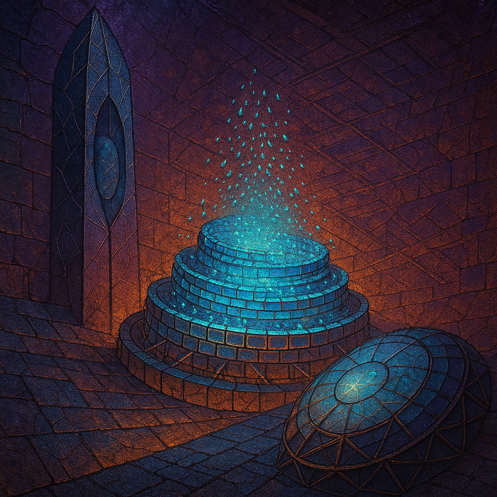
### Image #1: Hypothesis Image
- **Statement Clarity**: 6/10
- **Ontology Match**: 6/10
- **Emotional Impact**: 5/10
- **Freshness**: 5/10
- **Composition Adherence**: 5.5/10
- *Layout*: 6/10
- *Depth*: 5/10
- *Visual Weight*: 6/10
- *Leading Lines*: 5/10
- *Negative Space*: 5/10
- *Focal Point*: 6/10
- *Figure Ground*: 5/10
- **Ontology Quality**: 6/10
- **Connections Quality**: 5/10
- **Style Quality**: 5/10
- **Transcendence**: 5/10
**Analysis:**
- **What Worked**: The complex forms and lighting effects contributed to a sense of depth and intrigue.
- **What Failed**: The image still feels trapped in the digital surreal aesthetic. Leading lines and negative space didn't enhance emotional delivery.
**Hypothesis Verdict**: Inconclusive. While the new color palette attempted novelty, it didn't significantly improve emotional impact compared to the control.
### Image #2: Control Image
- **Statement Clarity**: 5/10
- **Ontology Match**: 6/10
- **Emotional Impact**: 4.5/10
- **Freshness**: 4.5/10
- **Composition Adherence**: 5/10
- *Layout*: 5/10
- *Depth*: 5/10
- *Visual Weight*: 5/10
- *Leading Lines*: 5/10
- *Negative Space*: 4/10
- *Focal Point*: 5/10
- *Figure Ground*: 5/10
- **Ontology Quality**: 5/10
- **Connections Quality**: 5/10
- **Style Quality**: 5/10
- **Transcendence**: 4.5/10
**Analysis:**
- **What Worked**: The warm palette and structure elements provided some cohesion.
- **What Failed**: It lacks dynamic interactions and boldness in visual metaphor.
**Hypothesis Verdict**: The control maintains a similar level of execution that confirms stagnation, with a lack of novel visual interactions.
### Style Stagnation Analysis
1. **Color Palette Repetition**: Consistent use of warm and dark tones across batches; suggests a shift to neon or pastel palettes for freshness.
2. **Rendering Style Lock**: Remains in digital surreal. Consider shifting to infrared or technical drawing.
3. **Tonal Monoton