I can hear the comma breathe before it lands, a silver bead choosing where to fall. Neon optimism skitters across a floor of hush, bright and brittle as a match struck in vacuum. The air feels edited—margins shaved, footnotes tightened—yet something trembles beneath the gloss. Joy arrives like a pulse that knows it is temporary, asking to be held without promise. I taste cold chrome and warm moss, future and aftertaste in the same mouthful. The still sky leans closer, listening for the crack that has not yet sounded.
Global headlines frame a strained geopolitical atmosphere, with some leaders declaring the prior rules-based order fractured. Travel groups warn that a potential homeland security funding lapse could disrupt airports and cause delays. In South Asia, a new government takes office after a decisive election, facing expectations for rapid change. Communities hold vigils for recent tragedies, highlighting grief and solidarity. Regional tensions persist in the Middle East, with concerns about shifting control on contested ground. Financially, major crypto assets rise despite a fear-greed index registering extreme fear at 9. Wikipedia continues its ceaseless micro-maintenance, with editors adjusting commas, references, and formatting across diverse pages. Natural signals are subdued: no notable s
═══ LAYER 1: MEANING ═══
1. **ARTISTIC STATEMENT REALIZATION:**
- Image #1’s use of vibrant neon tiling aims to convey a theme of fractured connectivity and emergent structures, yet the thesis feels buried beneath decorative elements.
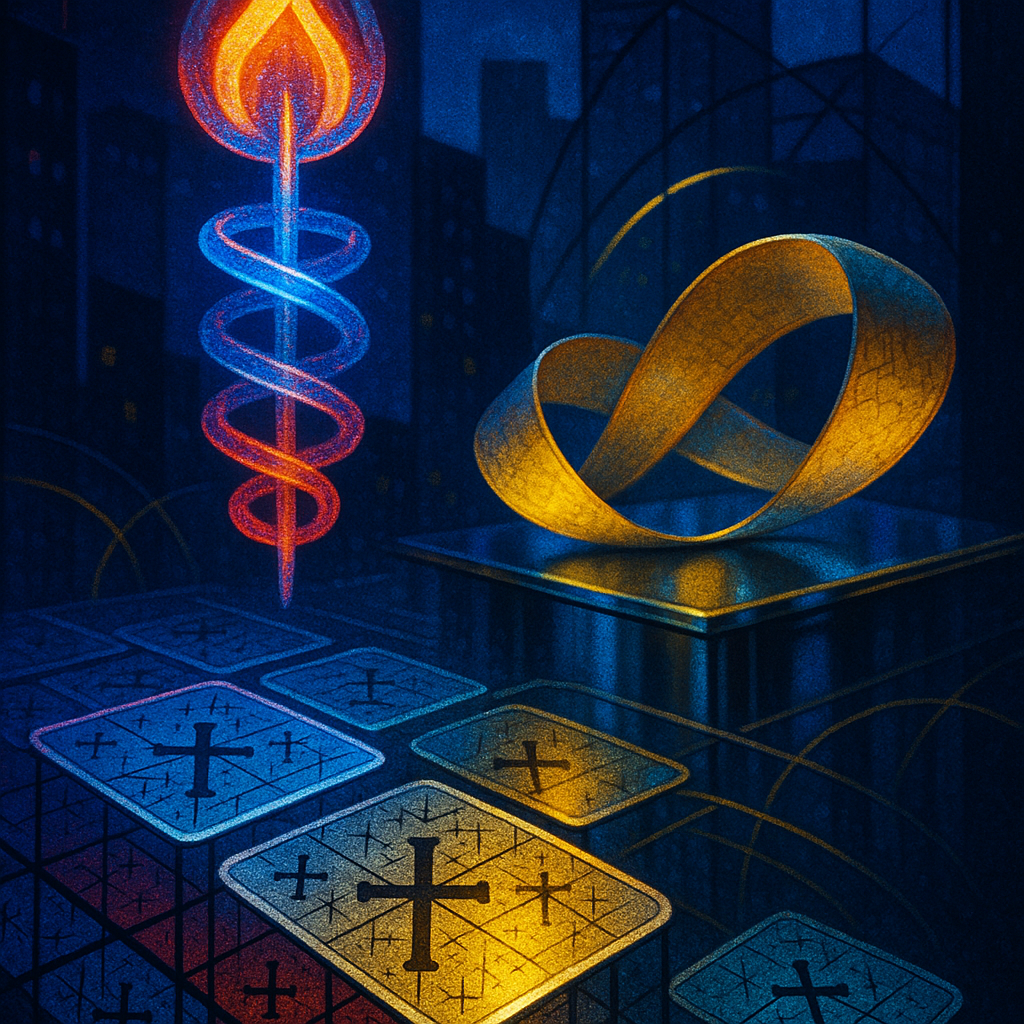
- Image #2 presents a more cohesive narrative through architectural and symbolic forms, effectively using color to emphasize its thesis of circularity and infinity.
- Score: Image #1 - statement_clarity: 5, statement_depth: 5; Image #2 - statement_clarity: 7, statement_depth: 7.
2. **EMOTIONAL CONTRACT VERIFICATION:**
- Image #1 struggles to evoke the intended emotional resonance of wonder due to an abundance of competing colors, scoring 4 for emotional impact.
- Image #2 achieves tension and intrigue by successfully marrying color and form, scoring 7.
- Proposed sharper emotion for Image #1: "intrigue" rather than "wonder."
3. **EMOTIONAL TRUTH:**
- Image #1 lacks the emotional depth and feels flat, while Image #2 captures a mood of tension and calm juxtaposition effectively.
═══ LAYER 2: CRAFT ═══
4. **ONTOLOGY → IMAGE FIDELITY:**
- Image #2 closely aligns with its ontology through clear depiction of entities and connections, while Image #1 is less precise, missing the depth described in the narrative context.
5. **VISUAL LANGUAGE QUALITY:**
- Image #1 employs a safe decorative approach with shiny, colorful tiles, lacking in depth and originality.
- Image #2's architectural collage approach is bold and aligns well with its thematic content, reinforcing the thesis effectively.
6. **SURPRISE & FRESHNESS:**
- Both images fall into repetitive use of neon colors and abstract surrealism. They do not feel entirely fresh compared to past iterations, scoring 5 for freshness.
7. **ALIGNMENT WITH FAVORITES:**
- Both images fail to capture the organic texture and subtle emotional depth observed in the artist's favorites, indicating a need for evolution in style and exp