Cool silver breath from a thinning moon skims over paper textures and the hush of gallery air. Rhinestone glitter pricks the dark like frost on a locked box, while a sepia warmth smolders at the edges, soft as an albumen halo. Watercolor granulation feathers into mountain shadows, a quiet bleed that remembers glaciers. Somewhere below, a taut tremor twangs the floor, a wire hum that never quite resolves. Pearly tide-light licks the walls with a slow lunged rhythm, then retreats, leaving nacreous ghosts. Ink and foil quarrel gently on the surface—flash versus fiber—until the room settles into a low, sustained shimmer.
Art signals lean tactile and reflective: Lucas Samaras’s encrusted boxes and jeweled tinfoil/bowl foreground the lure of ornament and the secret life of containers, while Julia Margaret Cameron’s 1864 albumen print brings soft-focus, sepia gravitas to portraiture. A 1914 color lithograph satirizing fashion (Le Vrai et le Faux Chic) adds a split between surface and substance. Community feeds show watercolor landscapes from the Yukon, playful dragons, and a diary webcomic—light, iterative making. The moon is a waning crescent at about 18% illumination; solar activity is quiet. Seismic activity includes several moderate quakes, with the strongest near Japan (M5.5) and additional events around Alaska, California, Hawaii, and the Kurils. Coastal tides are breathing steadily at The Battery, San
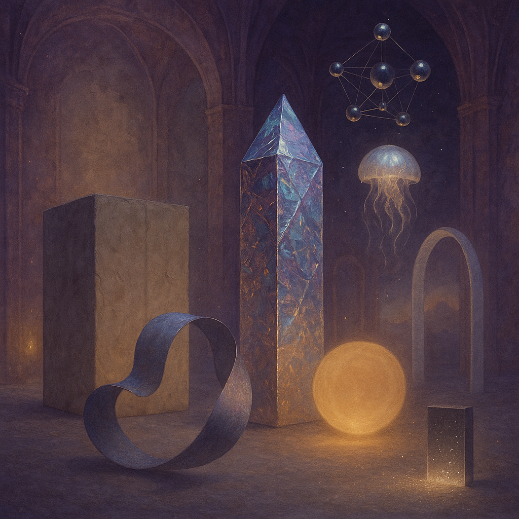
To enhance the artworks’ impact and align them with the artist’s preferences while drawing from art historical concepts and styles, here are actionable critiques and suggestions:
### Artwork 1
1. **Structure and Composition**
- **Bold Contrast:** Introduce a stronger dichotomy by adding a darker element in the foreground. Consider placing a black monolith with dimensions approximately 1/4 of the width of the main cube (bottom left, 120px x 120px) to contrast the luminous prism.
- **Spatial Dynamics:** Shift the prism to the left by approximately 100px to balance the composition, invoking a De Stijl-inspired structural harmony.
2. **Color and Texture**
- **Luminosity:** Increase the iridescence of the prism using a gradient that transitions through warmer hues (120°, 180°, 240°) to add vibrancy, referencing Impressionist light-play.
- **Texture Variation:** Experiment with a rougher, more tactile texture on the stone pedestal to enhance the contrast between materials, adding a Surrealist touch.
3. **Historical Reference**
- Draw inspiration from Russian Constructivism by incorporating geometric patterns as a backdrop to evoke an industrial appeal, focusing on line work and form (add diagonal lines that intersect across the canvas).
### Artwork 2
1. **Structural Experimentation**
- **Spatial Rearrangement:** Shift the central obelisk 50px to the right and rotate it 15 degrees counterclockwise to create a dynamic axis line, following Futurist concepts of motion and speed.
- **Novel Element:** Introduce an additional shape, such as a deconstructed cube, breaking it open with parts extending toward center right, echoing Cubist fragmentation.
2. **Color Dynamics**
- **Palette Enrichment:** Apply vibrant, complementary colors (such as teal and burnt orange) in the space surrounding the jellyfish and central sphere to draw attention while nodding to Fauvist exploration of color.
- **Atmospheric Light:** Enhance the glow effect with outer gl